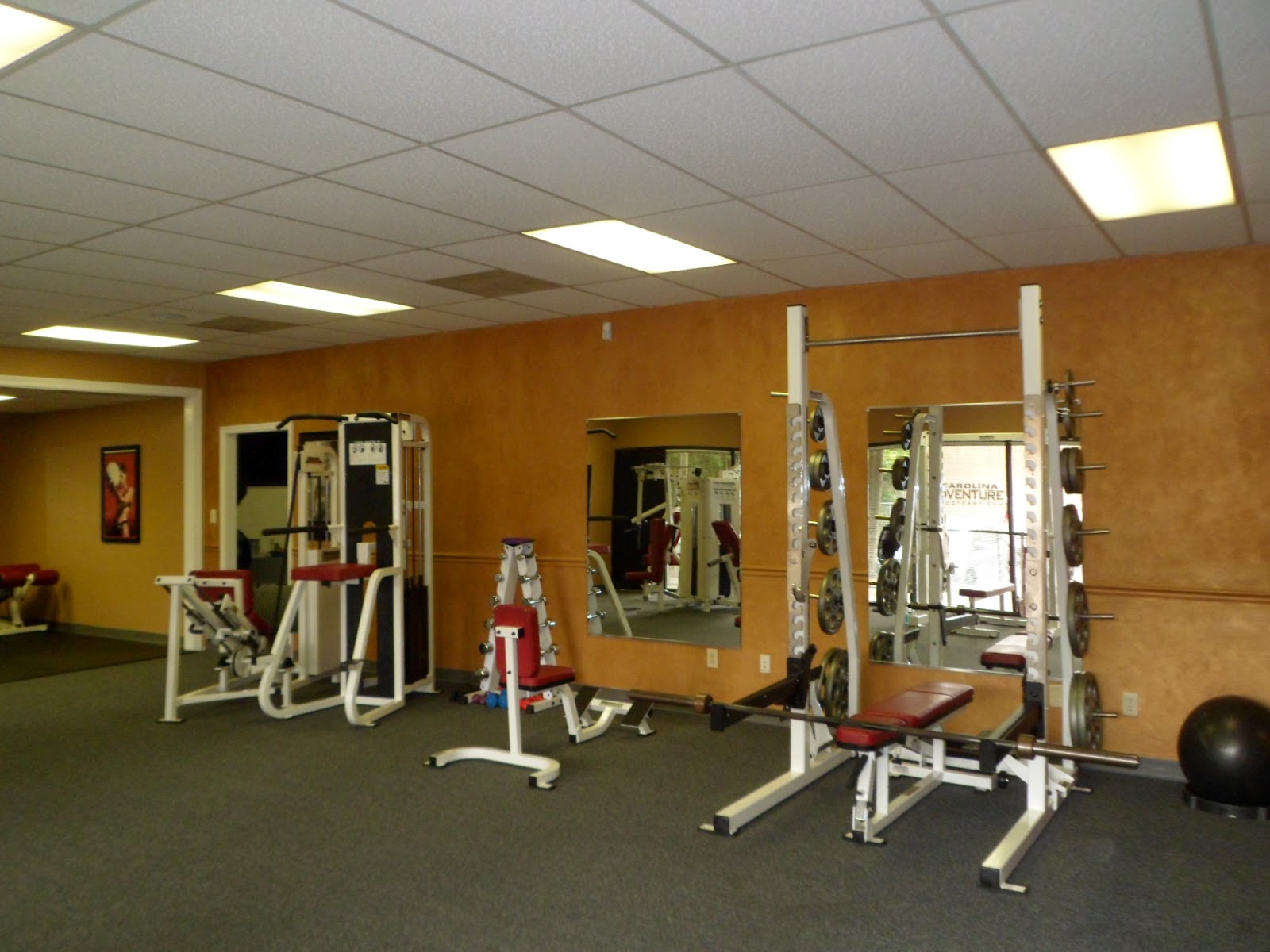
So they selected some very simple slate looking vinyl for the bathrooms and hallway. It had very rich color, so from that we quickly decided on some wall colors. We choose a slate blue venetian plaster for the bathrooms. For the main body of the personal training area, we choose a warm goldish terracotta. We glazed the back wall with an iridescent gold glaze. Once dry, we glazed over that with a very warm burnt umber glaze. We also glazed the hall wall with the burn umber glaze. All colors looked fabulous with the flooring and the gym equipment. This is not your father’s gym! It looks amazing and is so inviting to work out in. Makes you look forward to it! I’ll let you be your own judge.
Tuesday, May 15, 2012
The Baddest Gym in Town!
So this post is related to painting, in that we did some decorative painting in one of the coolest gym’s in town. This is the Matthews, NC location that houses Carolina Adventure Boot Camp, as well as the personal trainers that run it. My sister in law is one of the owners. I’ve been working out in her “boot camp” Monday, Wednesday and Friday at 5:30 am since October. It was brutal at first (not the getting up early, been doing that for years!), but the physical intensity. But, the plus side is you see results so much faster than easing into it. You get a great sense of accomplishment as you see you strength and endurance increase. And once it’s done at 6:30 and you have your whole day ahead of you! ( You don’t feel so bad about the bottle of wine, bag of chips or chocolate cake you ate the night before. Who am I kidding, I never feel bad about it anyway…)
Carolina Adventure Boot Camp, offers women only camps, co-ed camps, personal training, nutritional training and they have a massage therapist onsite. If you are looking for a great work out and wanting to get in shape, check out Maria’s website. I would love to see you out there! http://www.carolinaadventurebootcamp.com/site/index.php.
Monday, May 14, 2012
Black and Gold Crackled Chairs and an Antiqued Green Arm Chair
I love when my beloved clients want to keep an old piece of furniture, be it for sentimental memories or just to upcycle something and save a few trees. Two clients had chairs they wanted to transform. Both were nice, solid wood, but had seen better days.
.jpg)

The pair of jury chairs where definitely dated but were very solid. I saw a set of 12 of these on Craig's List for $50 each. http://charlotte.craigslist.org/fuo/2946229121.html. I think with a cool upholstered cushion on them and some caster wheels, they would make great game table chairs!
Both chairs needed to be lightly sanded and primed. I used a slightly off white latex, stain blocking primer.
The chair with the upholstered seat was to be green with a glaze. I used an interior latex paint in a eggshell finish. I used color 6970, Baltic Green from Porter/PPG Paints.
Since the jury chairs were going to be black and gold crackle I needed to start with a gold base. I used one of my favorite metallic bronze paints. Brushing on metallic paint does leave a brushed metal effect, but since a black crackle was going on top, it doesn't affect the finish.
Once the gold on the jury chair was dry, I applied a crackle size. It goes on milky and dries clear and shiny. It's what makes the topcoat crackle. Once the size was dry, I randomly brushed and stippled the black crackle paint. It's a bit thicker than regular paint, and dries slower to allow for better cracking.
Once the green paint was dry, I was able to glaze it with a chocolate glaze.
After the black crackle dried and the glaze was dry, I was able to add a polyurethane to both chairs. For the crackled jury chair, I used a latex, satin poly. For the antiqued chair, I mixed satin with flat poly to give a more aged appearance. Thought these turned out fabulous!
.jpg)
![]() |
| Jury Chair |
.jpg)

The pair of jury chairs where definitely dated but were very solid. I saw a set of 12 of these on Craig's List for $50 each. http://charlotte.craigslist.org/fuo/2946229121.html. I think with a cool upholstered cushion on them and some caster wheels, they would make great game table chairs!Both chairs needed to be lightly sanded and primed. I used a slightly off white latex, stain blocking primer.
The chair with the upholstered seat was to be green with a glaze. I used an interior latex paint in a eggshell finish. I used color 6970, Baltic Green from Porter/PPG Paints.
Since the jury chairs were going to be black and gold crackle I needed to start with a gold base. I used one of my favorite metallic bronze paints. Brushing on metallic paint does leave a brushed metal effect, but since a black crackle was going on top, it doesn't affect the finish.
Once the gold on the jury chair was dry, I applied a crackle size. It goes on milky and dries clear and shiny. It's what makes the topcoat crackle. Once the size was dry, I randomly brushed and stippled the black crackle paint. It's a bit thicker than regular paint, and dries slower to allow for better cracking.Once the green paint was dry, I was able to glaze it with a chocolate glaze.
After the black crackle dried and the glaze was dry, I was able to add a polyurethane to both chairs. For the crackled jury chair, I used a latex, satin poly. For the antiqued chair, I mixed satin with flat poly to give a more aged appearance. Thought these turned out fabulous!
.jpg)
Wednesday, May 2, 2012
Beautiful, Blooming Peony
Just had to share a few photos of my blooming pink peony! We purchased this plant many years ago from the Grower's Outlet on South Blvd. It was tiny and in the clearance pile for $5. We planted it, but thought maybe it got too much shade. We watched it get green, year after year with no blooms. We thought we just got what we paid for. After 3 or 4 years we moved it to a spot with a little more sun, and the next year it had one bloom!! We were so excited! I guess it needed to mature. It's been about 4 years now since we moved it and it gets more blooms each year and the blooms are getting bigger. That last frost affected some of the blooms, but not this one!
So pretty! I hope this reminds you that it is still spring, even though it feels like Summer!
Sunday, April 29, 2012
Grand Two Story Ceiling
Some people think ceilings should just be ceiling white. Those people are wrong. If you've never seen a ceiling finished in a soft metallic decorative finish or faux finish, you may feel the same way. Once you've done one ceiling, you want them all done. It's highly addictive, like cocaine or heroin. We've considered adding warning lables to our business cards. Warning "Women who are pregnant or nursing should not have a faux finish in your home, because you will want more and more and then you won't be able to send your baby to college". OK, maybe I'm exagerating. We're not that expensive and it's fabulous to have your entire home done....tastefully.
So this client has a two story ceiling. She wanted a metallic finish to reflect some light and to lighten the walls. This is the dramatic transformation.
This is the final ceiling with a ragged glaze of a slightly darker color silk paint. Very subtle but it definitely makes an impression when you walk into the foyer. I will be making some changes in the following months to my blog. I'm getting closer to my goal to be able to revel my special vendors. If you have do-it-yourselfer friends and family, please encourage them to follow my blog and comment as they like. Most of my products, I don't buy locally, so it will be a tremendous resource for those looking to get professional results on their own.
![]() |
| Ceiling before |
![]() |
| First layer of tan silk paint, brushed randomly |
You can see more examples of my finishes at www.paintingthetown.us. Thanks so much for following and sharing!
Monday, April 23, 2012
Vintage Turquoise Console and Side Table
![]() |
| Console before |
![]() |
| Side table before |
![]() |
| Applying second coat |
I love the detail of this console. Very heavy ornate trim. A perfect piece for distressing and "glazing".
Here's the side table with both coats completed.
I used their recommended wax. Since I wanted to "antique" the look on these pieces, they have to be clear waxed first. This seals the paint so that the colored wax doesn't absorb unevenly. I used a small brush to get the wax into the grooves and used a t-shirt clothe to buff the flat surfaces and spead the wax evenly. Waxing was a very different experience for me. It seemed a little more labor intensive than a traditional paint and glaze finish. May be it's just something I'm not used to. I let the clear wax dry a few days, before I could distress the finish. This is achieved with a rigid sanding block and 100 to 120 grit sand paper. I hit the edges and high points in the detail. I even added some within the body of the flat areas. Once the distressing was complete, I mixed a little raw umber with my wax. They actually make a tinted wax, but a little wax goes a long way, so I thought I'd just tint my own. Using the same technique, I brushed the tinted waxed into the grooves and used a soft cloth to move it around and give the pieces an aged look. For the side table, I added a fern stencil to the top. I added some warm silver metallic to the clear wax.
![]() |
| Fern Stencil |
The console turned out awesome too. I really wanted to paint the handles red, but decided a bronze paint would be more universally appealling. "Universally appealling"....such an ugly phrase. Maybe I should have done red... I would love your opinions and feedback! I love hearing from you all!
![]() |
| Completed vintage console |
![]() |
| Completed side table |
The product I used on these pieces can be purchased locally in Charlotte, NC at Great Walls Supply. Check out their website! http://www.greatwallssupply.com/ And as always, the console is currently for sale in my Dilworth Blacklion store on East Boulevard, and online in my Etsy store www.etsy.com/shop/savardstudios
Monday, April 16, 2012
Elegant Dining Room Transformation
One of my clients recently retired to a lovely ground floor condo. The only problem was that there is no window in the dining room.
The walls are done in a similar neutral color, but in a metallic plaster. The first layer moves along much better with two people. One person trowels on a thin coat in 3' X 3' sections. The second person, wearing gloves, creates a stried vertical pattern using their fingers.
Once complete, the wall has very slight vertical texture.
The next step is also done in a metallic plaster in a lighter tone than the base layer. This is scraped on tightly with a spatula. This is the finished wall!
![]() |
| Dining Room Before |
So while many dining rooms are beautiful with rich, bold colors, that wasn't an option for her. We decided to stay neutral and light, and pull in a metallic finish to reflect any available light.The ceiling is a fabulous, simple finish in one of my favorite metallic paints. It's not Las Vegas shiny, but instead leaves one thinking of the shimmer of fine silk. Simple and elegant for any room. Our first ceiling layer is brushed on randomly.
The second layer is mixed with a bit of glaze and smooshed around with a rag.
Once complete, the wall has very slight vertical texture.
The next step is also done in a metallic plaster in a lighter tone than the base layer. This is scraped on tightly with a spatula. This is the finished wall!
The finished room after pulling tape.
To see more finishes like these, check out my website at www.paintingthetown.us.
Silver Leafed 1900's Chest of Drawers
As you all know, I love to bling out some furniture! I found this fabulous old chest of drawers that needed a facelift. (Or maybe just a little "faux-tox".)
As always, I wasn't sure what direction I wanted to take it. After weeks of consideration on how to revamp this piece, I decided "I yam what I yam, so I'm going silver foil with a slight tarnished look". I call it champagne leaf, because it's not bright silver, but a slightly warmer version like the color of fine champagne. The final picture is at the end but photos do not do this finish justice. It just glows with beauty in person! I sanded this piece in preparation for a tinted primer. I wanted little "cracks" of color to break through the silver in random areas, as well as where some of the square sheets come together. For me, the distressed feel adds to the beauty of the silver leafed finish. Some prefer a totally solid silver finish as well. To save a step, I used a brown tinted primer.
![]() |
| Brown primed dresser drawers |
I then added my leafing size on this. Size is what dries sticky so the leafing sheets adhere to the surface. Oil tends to level and give a smoother finish. I use a water base since I prefer that aged, imperfect look. This goes on milky, but dries shiny and clear.
![]() |
| Dry size for foiling |
Once dry, I added the silver sheets one at a time. Silver leafing is very shiny!
Once this step was complete, I added a chocolate toned oil glaze to tweek the silver tone. The hardware was in decent shape, but I decided I just wanted it to be gloss black. I sprayed with a glossy black that was for direct to metal finishes. The final product!! Would love to hear what you think!
![]() |
| Antiqued silver leafed 1900's dresser |
I currently have this dresser in my Blacklion Booth in Dilworth www.eeeklectictown.com and in my Etsy store online http://www.etsy.com/listing/96779441/silver-leafed-chest-of-drawers-vintage.
Subscribe to:
Posts (Atom)
.jpg)
.jpg)
.jpg)
.jpg)


.jpg)
.jpg)
.jpg)


.jpg)


.jpg)